Income Growth and Future Poverty Rates of the Aged
ORES Working Paper No. 94 (released September 2001)
This paper estimates effects on elderly poverty rates of a steady growth in incomes for 50 years. It assumes that the poverty threshold continues to be adjusted for inflation but not for increases in real incomes. Simulations with the March 1998 Current Population Survey indicate that if Social Security and Supplemental Security Income (SSI) benefit rules are not changed and if earnings and other incomes grow by 1 percent per year (the growth rate in earnings assumed in the Social Security Trustees' Report intermediate scenario) in an otherwise unchanging population, poverty among the elderly will decrease from 10.5 percent to about 7.7 percent in 2020 and to 4.8 percent in 2047. Those projected poverty rates are quite sensitive to the earnings growth rate assumption and to the assumption that benefits are not further reduced to maintain solvency. The paper quantifies the sensitivity to these assumptions and discusses several other aspects that might affect future poverty rates—changes in other income components like SSI, earnings, and pensions; changes in longevity and marital patterns; and changes in the distribution of earnings.
The authors are with the Division of Economic Research, Office of Research, Evaluation, and Statistics, Office of Policy, Social Security Administration.
Acknowledgments: The authors wish to acknowledge comments received from Barbara Butrica, Susan Grad, Thomas Hungerford, Howard Iams, Michael Leonesio, Joyce Manchester, and Hilary Waldron.
Working papers in this series are preliminary materials circulated for review and comment. The findings and conclusions expressed in them are the authors' and do not necessarily represent the views of the Social Security Administration.
Summary
This paper estimates effects on elderly poverty rates of a steady growth in incomes for 50 years.It assumes that the poverty threshold continues to be adjusted for inflation but not for increases in real incomes. Simulations with the March 1998 Current Population Survey indicate that if Social Security and Supplemental Security Income (SSI) benefit rules are not changed and if earnings and other incomes grow by 1 percent per year (the growth rate in earnings assumed in the Social Security Trustees' Report intermediate scenario) in an otherwise unchanging population, poverty among the elderly will decrease from 10.5 percent to about 7.7 percent in 2020 and to 4.8 percent in 2047. Those projected poverty rates are quite sensitive to the earnings growth rate assumption and to the assumption that benefits are not further reduced to maintain solvency. The paper quantifies the sensitivity to these assumptions and discusses several other aspects that might affect future poverty rates—changes in other income components like SSI, earnings, and pensions; changes in longevity and marital patterns; and changes in the distribution of earnings.
Introduction
A sustained growth in earnings should eventually lead to lower poverty rates among the elderly.This paper attempts to roughly quantify the reduction in poverty that can be expected from several decades of growth in wages and to identify the important factors that might forestall this reduction.
The relationship between growing earnings and falling poverty rates among the elderly is fairly straightforward, although the exact size is difficult to project accurately. The most important components of retirement income—including Social Security benefits, pension income, and even much of the income from individual savings—are derived from labor earnings earlier in life. An increase in earnings should therefore lead eventually to an increase in the retirement incomes derived from those earnings. An increase in retirement incomes should reduce poverty among the elderly. Because the U.S. poverty line is indexed to prices rather than to real income growth, a prolonged period of income growth, by raising earnings and eventually retirement incomes relative to the poverty line, should reduce poverty among the elderly to low levels. The faster the growth in real incomes, the faster the fall in poverty rates.
Real earningshave not grown at a constant rate historically, and future long-term growth rates are quite uncertain. The annual Trustees' Reports for the Social Security trust funds have traditionally, to give an indication of the range of uncertainty, projected the funds under three scenarios that include three different long-term growth rates. In the 2000 report, these three rates were 1 percent per year in the "intermediate" scenario, 1.5 percent per year in the "low-cost" scenario, and 0.5 percent per year in the "high-cost" scenario. Because of the economic growth of the past few years, these illustrative growth rates were raised from the growth rates of earlier reports, and it is possible that continued growth will lead to still higher rates in future projections. The increasing weight given to the possibility of higher growth rates has raised the question of how long it would take for sustained economic growth to reduce the poverty rates to close to zero.
We will use the March 1998 Current Population Survey (CPS) to explore the question. The CPS is a Census survey of a nationally representative sample of more than 50,000 families containing more than 100,000 persons. The survey is conducted monthly, with labor force participation and employment questions that are the source of the official monthly unemployment statistics. The March CPS contains additional survey responses for income in the preceding year and is the source of the official poverty rate statistics.
The March 1998 CPS, with incomes and poverty lines for 1997, can answer quite accurately the following series of hypothetical questions: If every person's income in 1997 had been 10 percent higher while the poverty lines for each household remained fixed, how much would the poverty rate have fallen? Twenty percent higher? Thirty percent higher? And so on.
The same sort of exercise allows us to get a rough picture of the effects of projected trends in earnings growth. A 1 percent per year growth in earnings over 50 years, for example, would increase average earnings by 64 percent. By assuming that all unearned incomes rise proportionately and that the composition of the population and the relative incomes received by different components of the population do not change significantly in the next 50 years, we can obtain a rough prediction of the effect on poverty rates of 50 years of growth: we simply raise the income of each family in the 1997 population by 64 percent and compare it with the 1997 poverty threshold for that family. The percentage of persons in families whose increased incomes are still under the poverty line gives an estimate of the poverty rate after a 64 percent increase in incomes.
The roughness of the procedure for predicting and evaluating the effects of projected trends in earnings growth should be apparent. In actuality, not all incomes will rise at the same rate as earnings. Although many forms of retirement income are tied to earnings in such a way that they will rise more or less proportionately with earnings, the linkage is neither exact nor instantaneous. Social Security benefits, for example, could be subject to legislated adjustments that cause them to rise, over many decades, less rapidly than average earnings. Also, income from assets is quite uncertain from generation to generation and is tied to economic growth and to earnings growth only on average.
The detailed information in the CPS allows us to examine the sensitivity of the procedure to the assumption that all incomes rise at the same rate as earnings. It will indicate that the estimates are quite sensitive to the level of Social Security benefits but not nearly as sensitive to the level of other components of retirement income. For most of the estimates, accordingly, a more refined estimate will be made that abandons the assumption that Social Security benefits grow in strict pace with earnings. That approach allows us to model more accurately the legislated changes in benefits and the relationship between earnings growth and benefits that are built into the current system.
The other assumptions—that the composition of the elderly population and the relationships within that population between income and other characteristics like sex and marital status will remain steady—are not as easy to deal with. We know that the percentage of nonmarried persons in the population has been rising, so that the marital composition of the future retired population will include more never-married and divorced women than does the current retired population, a trend that in itself would tend to increase poverty rates among the elderly. But we also know that the earnings of those women have been increasing, a trend that will tend to decrease poverty among the elderly. By reweighting the CPS to reflect projected changes in the marital composition of the elderly population, the first sort of effect can be studied, but not the contribution of changes in average earnings.
The estimated level of the poverty rate among the elderly in 50 years, therefore, should be considered a broad-brush estimate. Nevertheless, the analysis presented here of the sensitivity of the poverty rate to the assumptions should be fairly robust. In other words, because of such things as the changing proportion of never-married women in the elderly population and the changing patterns of lifetime earnings for those women, our estimates of poverty rates in 50 years under the assumption of a 1 percent per year growth rate are necessarily uncertain. Our estimate of the difference it makes to have a growth rate of 1.5 percent per year rather than 1 percent will be much more precise.
This paper:
- Describes the U.S. poverty line and the CPS population used for much of the analysis,
- Presents estimates of the decline in poverty rates under three different income growth rates,
- Analyzes the different sources of income and their significance for poverty,
- Discusses some demographic factors that might alter the projected trend in poverty, and
- Looks at the distribution of earnings and its importance for poverty measurement.
The Poverty Line and the March CPS
The U.S. poverty line was determined in the early 1960s as the amount of income that was needed to keep a household above a line defined partly by needs for food and housing. (Different lines were calculated for different-sized households.) Although the original intent may have been to periodically recalculate these income thresholds, the actual practice has been to merely adjust the original lines by changes in the consumer price index (CPI). Hence, if real incomes grow—that is, if nominal incomes grow faster than price—more households will rise above the poverty lines; and if real incomes continue to rise for a long enough period, it is possible for poverty rates to shrink toward zero.
Other methods for calculating the poverty line have been proposed, under which poverty rates would not necessarily approach zero (see, for example, Short and Iceland (2000) and Johnson and Smeeding (2000)). A "relative" poverty line, for example, in which the poverty line was defined as some fixed percentage of the median income, would rise along with any general rise in incomes, leaving the poverty rate unchanged unless the distribution of incomes changed. A poverty line that was continually recalculated according to changing definitions of basic needs might rise along with a general rise in incomes if perceptions of basic needs rose with the general rise in incomes.
For many purposes, these alternative methods for calculating the poverty line might provide better measures than the current method for determining the number of people in poverty. The current definition of the poverty line, however, has one very useful characteristic for our purpose: it provides a fixed yardstick against which the distribution of real incomes can be measured as average real incomes rise. In order to measure how much a rising economic tide is lifting the boats, we need a measuring stick that does not rise with the tide. Although an absolute measure will not reflect evolving notions of what it means to be poor, it will indicate very clearly the effect a general rise in incomes has in moving the poorer end of the income distribution above a fixed real income standard1
The official poverty rate each year is calculated from the March CPS, which asks for incomes in the preceding year for all adults in the surveyed households. In the March 1998 CPS (the CPS used for the projections in this paper), the respondent in each surveyed household was asked how much income had been received in 1997 by each adult in the household. CPS respondents are questioned explicitly about many types of income, including earnings, Social Security benefits, pensions, Supplemental Security Income (SSI), and interest income2 For the poverty rate calculations, the incomes of all the individuals in a family are added up and compared with the 1997 poverty threshold that applies to families of that size and composition. If the family income is below the poverty threshold, that family is included in the count of families in poverty, and all the persons in the family are included in the count of persons in poverty. The poverty rate is the estimated total number of persons in poverty divided by the total number of persons.
For the estimates in this study, the same procedure is replicated, except that each person's income amounts are adjusted before adding up the family income and comparing it with the poverty threshold for that family. The effects of a general rise in incomes are studied by scaling up all incomes uniformly. The effects of more specific changes, such as a reduction in Social Security benefits, are examined by adjusting the specific income components under study.
The March 1998 CPS sample is designed to represent the income and demographic status of the population in 1997 and does not necessarily give an accurate picture of the economic and demographic relationships in the population in future years. The relationships between age, marital status, and income that it does contain, however, provide a useful starting point for analyzing the effects of income growth.
Poverty Rates Under a General Rise in Incomes
The Decline in Historical Poverty Rates
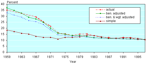
We will first focus on the effects of a general rise in income. If everyone's incomes rise proportionately, how fast can we expect the poverty rate to fall? Before we get to that question, we will test the procedure on historical experience. We ask what would happen to the poverty rates of the elderly if, running history backward from 1997 to 1959, everyone's incomes were to be reduced to levels proportional to the lower average earnings of those years. The actual poverty rates for 1959, for 1967 through 1997, and for three different "back projections" using the 1997 data are shown in Chart 1.
Poverty rates of the elderly
| Year | Actual | Beneficiaries adjusted |
Beneficiaries and weight adjusted |
Simple |
|---|---|---|---|---|
| 1959 | 35.2 | 36.82718 | 32.91162 | 18.43069 |
| 1961 | 34.71954 | 30.95922 | 17.31318 | |
| 1963 | 32.44372 | 29.21087 | 15.84304 | |
| 1965 | 28.97679 | 26.297 | 15.0527 | |
| 1967 | 29.5 | 27.56683 | 25.40786 | 13.20945 |
| 1969 | 25.3 | 24.79398 | 23.18558 | 12.47973 |
| 1971 | 21.6 | 19.99547 | 18.63203 | 12.48098 |
| 1973 | 16.3 | 15.72241 | 14.61081 | 10.87626 |
| 1975 | 15.3 | 15.02608 | 13.95148 | 12.49944 |
| 1977 | 14.2 | 13.9389 | 13.36085 | 12.33129 |
| 1979 | 15.2 | 13.85361 | 13.48948 | 12.84296 |
| 1981 | 15.3 | 12.95989 | 12.64936 | 14.25682 |
| 1983 | 13.8 | 12.02769 | 12.00216 | 13.80189 |
| 1985 | 12.6 | 11.78153 | 11.8894 | 12.81729 |
| 1987 | 12.5 | 11.43772 | 11.50341 | 11.8608 |
| 1989 | 11.4 | 11.29576 | 11.31 | 11.85532 |
| 1991 | 12.4 | 11.13522 | 11.15865 | 12.06914 |
| 1993 | 12.2 | 10.98544 | 10.98042 | 12.03267 |
| 1995 | 10.5 | 10.79377 | 10.77528 | 11.60559 |
| 1997 | 10.5 | 10.57695 | 10.57695 | 10.57695 |
The first back projection uses the simplest projection procedure, scaling all incomes by the ratio of average earnings in the simulation year to average earnings in 1997. This procedure substantially underestimates elderly poverty in 1959, approaching the correct levels only in the second half of the simulation. This underestimate is almost entirely the result of a series of Social Security benefit increases from 1950 through the mid-1970s, increases that gradually worked their way through the elderly population. The structure of benefits in 1997 is not appropriate for the simulation of the structure in 1959, both because the overall level of benefits relative to average earnings was lower in 1959 and because the age structure of benefits—average benefits paid to 85-year-olds compared with average benefits paid to 65-year-olds—was much different in 1959.
Because the benefit formulas have been relatively stable since the early 1980s, the simple projection procedure performed better in the second half of the historical period and should perform better for projections into the future. There is reason, however, for caution about merely extrapolating that procedure. As will be shown later, the poverty rate simulations are much more sensitive to changes in Social Security benefits than to any other component of retirement income, so it is important to make sure that the structure of Social Security benefits in the projection is as accurate as possible. The 1997 benefit structure differs from the future benefit structure in two known ways. First, it does not include the effects of the scheduled increases in the normal retirement age for workers who reach 65 from 2003 through 2025, increases that will have the effect of slightly reducing benefit levels. Second, as the 1997 population of beneficiaries dies, the effects of some expired benefit provisions that do not apply to new beneficiaries will gradually disappear.
The projections, accordingly, adjust the benefit levels at each age in each simulation year to reflect changes between 1997 and the simulation year. These adjustments, which are based on calculations of worker benefits paid to average lifetime earners for all birth cohorts from 1869 (age 90 in 1959) through 1982 (age 65 in 2047) are described in Appendix A. The results of these adjustments for the historical period are shown in Chart 1 (labeled "ben. adjusted"). The simulated poverty rates now capture the sharp reduction of poverty rates through 1975 as the Social Security program matured. Apart from underestimates of the elderly poverty rate in two recent periods (one centered in the early 1980s and the other in the early 1990s), the simulation closely tracks the trend of poverty rates as far back as 1959, never diverging by more than 2.3 percentage points. The recent underestimates may be attributed to the inability of 1997 data to simulate poverty rates during recessions. The earlier misestimates can be the result of a variety of factors, including the simplicity of the benefit approximation (the adjustments are based on changes to the benefits of workers with average earnings, rather than those whose benefits put them near the poverty line, and do not reflect several important changes in spouse and widow benefits). The ability of the technique to project general trends, but with frequent errors of 1 or 2 percentage points in the predicted poverty rates, should be borne in mind when looking at 50-year projections into the future. The actual poverty rates in the future will fluctuate much more than do our smooth projections, and it is possible for the projections to have cumulative errors of several percentage points over 50 years.
One other adjustment to the projections is examined in Chart 1: an adjustment reflecting the changing marital status composition of the elderly population between 1959 and 1997. Using historical data for population by age, sex, and marital status, the tabulation weights are adjusted to give the simulation population the marital status composition of the simulation year rather than the composition observed in 1997. The resulting poverty rate estimates are shown in Chart 1 ("ben. & wgt. adjusted"). The poverty rate in 1959, when adjusted to the 1959 marital status composition, is lower than the unadjusted estimate. That is mainly due to the significantly smaller proportion of poor divorced persons in 1959.
The percentage composition adjustment shown in Chart 1 does not give the complete picture of the effects of changes in marital status on the poverty rate. There may have been changes in average incomes associated with the marital status trends that are not captured in this adjustment. Divorced elderly women in 1959, for example, may have had relatively smaller worker benefits than their counterparts in 1997 and were less protected with regard to spouse benefits as well, causing the 1997 poverty rate for divorced elderly women to underestimate the 1959 poverty rate for divorced elderly persons.
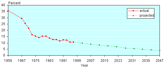
The Projected Decline in Poverty Rates
Chart 2 shows future poverty rates along with the historical poverty rates discussed in the last section. Estimates of future poverty rates assume that all incomes, including Social Security benefits, increase in real terms by 1 percent per year (the intermediate assumption of the Trustees' Report). (The increase from 1997–2047 is 64.5 percent, calculated as 1.0150 = 1.6446.) If all family incomes were to grow evenly at that rate, the poverty rate for the elderly would fall from 10.5 percent in 1997 to approximately 7.2 percent in 2020 and 4.1 percent in 2047.
Past and future poverty rates of the elderly
| Year | Actual | Projected |
|---|---|---|
| 1959 | 35.2 | |
| 1961 | ||
| 1963 | ||
| 1965 | ||
| 1967 | 29.5 | |
| 1969 | 25.3 | |
| 1971 | 21.6 | |
| 1973 | 16.3 | |
| 1975 | 15.3 | |
| 1977 | 14.2 | |
| 1979 | 15.2 | |
| 1981 | 15.3 | |
| 1983 | 13.8 | |
| 1985 | 12.6 | |
| 1987 | 12.5 | |
| 1989 | 11.4 | |
| 1991 | 12.4 | |
| 1993 | 12.2 | |
| 1995 | 10.5 | |
| 1997 | 10.5 | 10.57695 |
| 2002 | 9.91373 | |
| 2007 | 8.93461 | |
| 2012 | 8.4237 | |
| 2017 | 7.6785 | |
| 2022 | 6.87397 | |
| 2027 | 5.92959 | |
| 2032 | 5.49193 | |
| 2037 | 5.01025 | |
| 2042 | 4.59302 | |
| 2047 | 4.12996 | |
As noted in the preceding section, the pattern of average benefits by age in 1997 will not replicate itself in the future, both because of legislated changes—the increase in the normal retirement age—and because of the presence in 1997 of lingering effects from past changes in benefits. The projection in Chart 2 adjusts for these legislated changes in past and future benefits.
A second projection was also attempted, adjusting for projected changes in the marital status composition using projections by Social Security's Office of the Chief Actuary for size of the population by age, sex, and marital status. Although this adjustment has large effects on the historical back projection shown in Chart 1, the effects on the future projection are negligible. These effects are small, not because there are no large changes in the projected marital status composition but because the changes that are projected have almost exactly offsetting effects. In particular, the percentage of widowed women in the elderly population is projected to decline substantially (the effect of increasing longevity in post-poning the death of married men apparently more than offsets the postponed deaths of widowed women), and the decline in the percentage of widowed women who have high poverty rates in 1997 offsets the increase in the percentage of divorced and never-married persons who also have high poverty rates. Because the effects of adjusting for percentage composition by marital status are so small, they are not shown in Chart 2 and are not used in the remaining simulations.
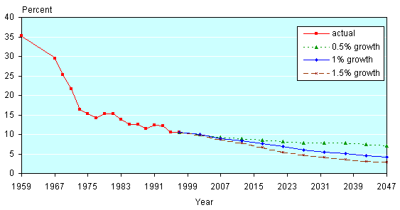
The Sensitivity of the Decline in Poverty Rates to the Rate of Growth of Incomes
Chart 2 assumes that real wages grow at 1 percent per year. Chart 3 presents projections for two other growth rates in addition to the Trustees' intermediate growth rate—the 1.5 percent per year growth rate of the low-cost scenario and the 0.5 percent per year growth rate of the high-cost scenario.
Projected poverty rates of the elderly, under three growth assumptions
| Year | Actual | 0.5 percent growth |
1 percent growth |
1.5 percent growth |
|---|---|---|---|---|
| 1959 | 35.2 | |||
| 1961 | ||||
| 1963 | ||||
| 1965 | ||||
| 1967 | 29.5 | |||
| 1969 | 25.3 | |||
| 1971 | 21.6 | |||
| 1973 | 16.3 | |||
| 1975 | 15.3 | |||
| 1977 | 14.2 | |||
| 1979 | 15.2 | |||
| 1981 | 15.3 | |||
| 1983 | 13.8 | |||
| 1985 | 12.6 | |||
| 1987 | 12.5 | |||
| 1989 | 11.4 | |||
| 1991 | 12.4 | |||
| 1993 | 12.2 | |||
| 1995 | 10.5 | |||
| 1997 | 10.5 | 10.57695 | 10.57695 | 10.57695 |
| 2002 | 9.9967 | 9.91373 | 9.78783 | |
| 2007 | 9.30001 | 8.93461 | 8.69127 | |
| 2012 | 8.93218 | 8.4237 | 7.84464 | |
| 2017 | 8.48062 | 7.6785 | 6.67841 | |
| 2022 | 8.20978 | 6.87397 | 5.4662 | |
| 2027 | 7.87449 | 5.92959 | 4.70077 | |
| 2032 | 7.85859 | 5.49193 | 4.18483 | |
| 2037 | 7.75547 | 5.01025 | 3.64724 | |
| 2042 | 7.50143 | 4.59302 | 3.1607 | |
| 2047 | 7.08813 | 4.12996 | 2.83013 | |
For the population aged 65 or older, the 10.5 percent poverty rate of 1997 falls to 7.0 percent under the low-growth assumption, 4.1 percent under the intermediate assumption, and 2.8 percent under the high-growth assumption. The poverty rate continues to decline steadily even under the low-growth assumption
Components of Retirement Income
The simple simulations discussed earlier assume that all nonbenefit incomes rise at the same rate as the projected increase in average earnings and that the demographic composition of the population does not change. However, a number of factors could, particularly in the short run, offset or accelerate the long-term trend decline in the poverty rate.
Table 1 displays the share of some components of total income.3 (See Appendix B for summary statistics.) Not surprisingly, Social Security benefits are the largest source of income for persons aged 65 or older, whereas younger people derive most of their income from earnings. Supplemental Security Income is the smallest component of those listed, between 1 percent and 2 percent of income whether persons are young or old.
| Aged 65 or older | Under 65 | All | |
|---|---|---|---|
| Social Security income | 53.10 | 3.82 | 9.73 |
| Earnings a | 16.30 | 83.84 | 75.74 |
| Pensions b | 14.72 | 1.62 | 3.19 |
| Asset income c | 11.35 | 2.92 | 3.93 |
| Supplemental Security Income | 1.93 | 1.40 | 1.47 |
| NOTE: CPS March 1998 data file. | |||
| a. Earnings include wages and salaries, self-employment earnings, and farm earnings. | |||
| b. Pensions include public and private pensions as well as survivor's income. | |||
| c. Asset income includes dividends, interest, and rent. | |||
If any one component of retirement income rises more slowly than assumed in the preceding section, poverty rates will not fall as much. The effect on poverty will depend on how important that component of income is for persons at or below the poverty line: the more important the component, the more slowly poverty rates will fall if that component does not increase at the same rate as other income components.
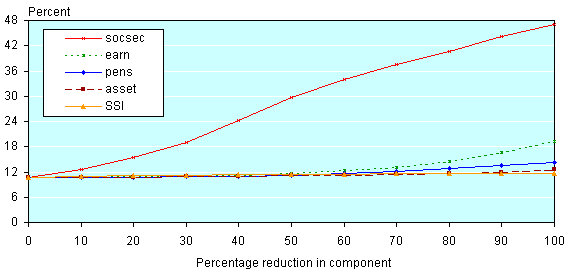
The sensitivity of poverty rates to slower growth among particular components can be indicated by tabulating the effects on the 1997 poverty rate of reductions of particular components. If, for example, all but one component grew by 1.0 percent per year, or by 64 percent over 50 years, but the remaining component remained at its 1997 level, that component would have fallen by 39 percent relative to the other components (100 is 39 percent less than 164). Tabulating poverty rates in 1997 after that component has been reduced by 39 percent, therefore, can indicate the effect of nongrowth in that component. If the component grows, but by less than 1 percent per year, the corresponding reduction in 1997 would be somewhere between 0 percent and 39 percent. If the component falls in real terms, the corresponding reduction in 1997 would be greater than 39 percent. Chart 4 shows effects on the 1997 poverty rate of reducing each major component of retirement income by amounts ranging from 10 percent to 100 percent while holding the other components constant. Each of these components—Social Security benefits, earnings, pension benefits, Supplemental Security Income, and asset income—is discussed below.
Poverty rates of the elderly in 1997 as components of income are reduced.
| Percentage reduction in component |
socsec | earn | pens | asset | SSI |
|---|---|---|---|---|---|
| 0 | 10.57695 | 10.57695 | 10.57695 | 10.57695 | 10.57695 |
| 10 | 12.69407 | 10.68657 | 10.64434 | 10.63838 | 10.82863 |
| 20 | 15.5395 | 10.82063 | 10.76862 | 10.75365 | 11.05202 |
| 30 | 18.92236 | 11.00394 | 10.84265 | 10.89931 | 11.22378 |
| 40 | 24.28803 | 11.28132 | 11.0127 | 10.92788 | 11.29091 |
| 50 | 29.61959 | 11.69365 | 11.25299 | 11.05082 | 11.38345 |
| 60 | 33.91567 | 12.25746 | 11.61392 | 11.1497 | 11.47109 |
| 70 | 37.60995 | 13.17563 | 12.12675 | 11.30204 | 11.5414 |
| 80 | 40.75233 | 14.42669 | 12.78831 | 11.53455 | 11.59586 |
| 90 | 44.08949 | 16.56099 | 13.51258 | 11.96089 | 11.64115 |
| 100 | 47.13145 | 19.20053 | 14.34666 | 12.60282 | 11.70395 |
Social Security Benefits. Because Social Security benefits constituted approximately 53 percent of the income of elderly persons in 1997 (Table 1), we should expect the poverty rate of the elderly to be very sensitive to changes in these benefits. This is borne out in Chart 4 where, as Social Security benefits are gradually reduced, poverty among the aged increases quite substantially. A 20 percent reduction in this component of income for the elderly, for example, pushes poverty from 10.5 percent to 15.5 percent in 1997. A 100 percent reduction in Social Security benefits would increase their poverty rate to almost 50 percent, assuming no other changes.4
Earnings. As Chart 4 shows, completely eliminating earnings among the elderly in 1997 would have increased their poverty rate to about 19 percent. A reduction of their earnings by 50 percent or less, however, would have a relatively much smaller effect on their poverty rates. This finding indicates that elderly persons who do have earnings tend to have family incomes well above the poverty line. The projection technique used in this paper to estimate future poverty rates, therefore, should not be overly sensitive to slight changes in the amount of earnings among the elderly who do have earnings.
If the future elderly were to retire later on average, so that earnings income would play a relatively larger role in retirement income, their poverty rate would go down, but the sensitivity of the poverty rate to the presence or absence of earnings would increase. We have little basis, however, for quantifying the effects of such a behavioral change, since the size of the effect would depend not only on how much later the average retirement would occur but also on which workers in the earnings distribution were postponing retirement and which were relying on a transitional period of part-time jobs.
If retirement ages rise sufficiently for a broad enough distribution of workers, then one might question whether a constant age definition of "elderly"—aged 65 or older—is appropriate for comparisons over 50 years.
Pension Benefits. Table 1 shows that pension benefits were the third largest component of income for people aged 65 and older in 1997, accounting for 14.7 percent of elderly income. Chart 4 indicates that, as with earnings, small reductions in pension benefits do not entail substantial increases in poverty among the elderly. We see the importance of this component when it is cut by at least 60 percent: in this case, poverty among the elderly goes up from 10.5 percent to 11.6 percent. Completely eliminating pension benefits brings that rate to 14.3 percent.
The assumption in the 50-year simulation that pension benefits will rise in rough proportion with earnings growth is probably a reasonable first approximation. Benefit formulas of defined benefit pension plans have the effect of roughly indexing pensions at retirement to the growth in average wages. Defined contribution plans base their benefits on the annuitization of accumulated contributions from earnings, so they too should rise if earnings rise, although the link is looser.
Nevertheless, pensions among the elderly in 1997 are not a very robust indication of what pensions will be in the future. The composition of benefits in the younger population has been shifting from defined benefit plans to defined contribution plans, altering the relation between preretirement earnings and pension benefits. Much of the population, furthermore, is not covered by pension benefits. Any changes in coverage among the part of the working population that will end up near the poverty line in retirement will affect poverty rates in ways that are not accounted for in the simple simulation we have used.
Supplemental Security Income. In 1997, SSI was, on average, the least important of the five components in Table 1 making up elderly income. As shown in Chart 4, completely eliminating SSI benefits in 1997 would have increased the elderly poverty rate to just under 12 percent, a smaller increase than when any other component is eliminated. Since most SSI recipients are already below the poverty line, a reduction in SSI, although it would reduce the income of people in poverty, would not increase the number of persons in poverty. Statistical tools that focus on changes in incomes for people just above the poverty line are simply inadequate for analyzing effects on a group of persons already at or below the poverty line. Although not readily seen in Chart 4, reductions in SSI of 40 percent or less have larger effects on the poverty rate of the elderly than a corresponding reduction in any other component except Social Security benefits. Among the relatively small population of SSI recipients, there are enough persons just above the poverty line that even small reductions of SSI relative to other income will have effects on the poverty rate. As the poverty rate of the elderly falls, the SSI population should make up an increasing proportion of the elderly in poverty, and the poverty rate should become more sensitive to changes in SSI relative to other incomes.
The assumption that SSI payments will increase along with real economic growth can be questioned. SSI payment levels are indexed to the CPI, so they do not change relative to the poverty line unless higher payment levels are enacted. 5If Congress continues to allow the payment levels to grow only with the CPI, and if other incomes grow 1 percent a year faster than the CPI, then the share of SSI in elderly income will gradually shrink.
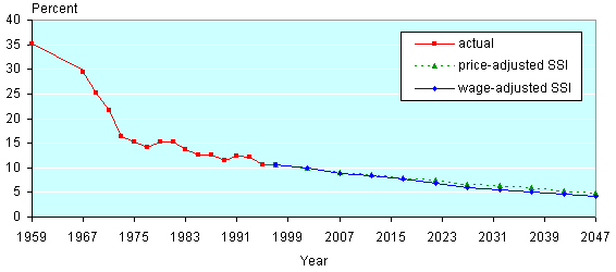
The March 1998 CPS can be used to test the sensitivity of the poverty rate to the treatment of SSI by holding SSI payments constant while increasing other incomes. The earlier simulation indicated that if legislative changes were to keep SSI growing with real wages, poverty for this group would decline to 7.2 percent in 2020 and to about 4.1 percent in 2047. Under the alternative simulation in which SSI payments increased with prices, the poverty rates would be about one-half percentage point higher—7.7 percent in 2020 and 4.8 percent in 2047 (see Chart 5). Although fairly small in absolute terms, this difference in 2047 means an increase of more than 17 percent in the poverty rate of the elderly.
Projected poverty rates of the elderly with wage-adjusted and price-adjusted SSI.
| Year | Actual | Price- adjusted SSI |
Wage- adjusted SSI |
|---|---|---|---|
| 1959 | 35.2 | ||
| 1961 | |||
| 1963 | |||
| 1965 | |||
| 1967 | 29.5 | ||
| 1969 | 25.3 | ||
| 1971 | 21.6 | ||
| 1973 | 16.3 | ||
| 1975 | 15.3 | ||
| 1977 | 14.2 | ||
| 1979 | 15.2 | ||
| 1981 | 15.3 | ||
| 1983 | 13.8 | ||
| 1985 | 12.6 | ||
| 1987 | 12.5 | ||
| 1989 | 11.4 | ||
| 1991 | 12.4 | ||
| 1993 | 12.2 | ||
| 1995 | 10.5 | ||
| 1997 | 10.5 | 10.57695 | 10.57695 |
| 2002 | 9.95393 | 9.91373 | |
| 2007 | 9.11379 | 8.93461 | |
| 2012 | 8.68462 | 8.4237 | |
| 2017 | 8.03805 | 7.6785 | |
| 2022 | 7.46248 | 6.87397 | |
| 2027 | 6.70006 | 5.92959 | |
| 2032 | 6.32861 | 5.49193 | |
| 2037 | 5.88607 | 5.01025 | |
| 2042 | 5.36383 | 4.59302 | |
| 2047 | 4.84394 | 4.12996 | |
Asset Income. The asset income category in Table 1 and Chart 4 refers to income from investment assets—dividends, interest, and rent (capital gains are not included in Census income except for mutual fund gains that survey respondents might report as dividends).
Because most investments arise originally from saving out of earnings, it is plausible that investments will grow as earnings grow, although the links between preretirement earnings and investment assets will be considerably looser than those between Social Security benefits and pensions. Unlike Social Security benefits, which are indexed to average national earnings in the year retirees turn age 60, and pensions, which are often calculated on the basis of earnings in the last few years before retirement, investment assets have their basis in savings that may have been made many years before retirement. The rate of return to those investments, furthermore, will vary much more from cohort to cohort than does the rate of return implicit in the Social Security benefit formula. Over long periods, however, it may be reasonable to assume that growth in retirement income from investment assets will, on average, keep pace with growth in earnings.
Because income from investment assets forms an even smaller proportion of the income of the elderly than do pensions, the poverty rate of the elderly is not very sensitive to reductions in that component (Chart 4). The 50-year picture of declining poverty rates should therefore not be very sensitive to changes in average incomes from investment assets.
As with pensions, trends in the long-term patterns of saving could modify the results. Higher-income households tend to save more than do lower-income households. Many lower-income households save virtually nothing; they rely completely on Social Security benefits and, if they have them, on pensions. If a greater proportion of future lower-income households saved for retirement in addition to their pensions, then expected poverty rates would be reduced below those in the 50-year simulation and the sensitivity of the poverty rates with respect to investment incomes would increase. If income from savings became a major component of retirement income for households near the poverty line, the long-term uncertainty of asset incomes would become an important factor in analyzing poverty rates.
Demographic Factors
The 50-year simulation assumes that the demographic structure of the elderly population will remain the same over the next 50 years as it was in 1997, aside from an overall growth in size. But that assumption is clearly wrong in at least two ways: lifespans will probably increase, so that the average age among the 65-plus population will increase, and the marital histories experienced by the elderly population will change. The simple CPS extrapolation we have been using, however, cannot adequately handle these issues, and all we can do here is give some qualitative statements about the possible effects of these trends on elderly poverty rates.
Changes in Longevity
The effects of increasing longevity on poverty rates of the elderly will depend in part on how average retirement ages and contributions to retirement incomes respond to the increasing span of life after age 65. If neither behavior changes, there will be a larger number of years over which retirement incomes must be spread, reducing the average payment each year and therefore increasing the poverty rates above those indicated in the simulations. (Social Security benefits are not explicitly reduced if longevity increases. But an otherwise solvent Social Security system will have to reduce benefits if longevity increases but contributions do not. Similar constraints apply to private pension providers and even to workers saving on their own.)
If retirement and saving behavior does respond to longevity increases—with workers saving more or retiring later, pension providers calculating higher contributions to pension funds or providing for later retirement ages, and the Social Security system enacting appropriate changes in contributions or benefits—then poverty rates will not increase as much. If average retirement ages increase, and if the elderly continue to be defined as those aged 65 or older even after 50 years of longevity increases, then there may be additional downward pressure on poverty rates from the increase in earnings among the elderly population.
Changes in Marital Patterns
Because the official poverty line takes family composition into account, so that it takes more per capita income to stay above the poverty line for one-person families (never-married or divorced women) than it does for multiperson families (married couples), then the shift to greater proportions of nonmarried persons can increase poverty rates. However, as already discussed, adjusting for these changes in the composition of the elderly population has little effect on the estimates of future poverty rates. On the other hand, there may be important changes in average incomes by marital status that are not accounted for in those adjustments. Sorting out the possible effects can only be done with much more complex simulation models and even then would be contingent on the assumptions made about trends in future marriage patterns and earnings.
Fewer persons have been getting married, and more married persons have been getting divorced before the 10-year married period that qualifies them for spouse benefits. If today's married woman with a worker benefit less than her spousal benefit is tomorrow's never-married beneficiary or divorced-worker beneficiary with less than 10 years of marriage, then average benefits will be reduced by the difference between the woman's own worker benefit and the spouse benefit she would have been receiving. But this trend is offset to the extent that nonmarried women are more likely to work or to work at higher-paying jobs than they had in the past as married women.
Many married women who receive worker benefits also receive spouse benefits on the basis of their husband's larger worker benefits. The total benefit these women receive is determined by the size of their husband's worker benefit rather than by the size of their own worker benefit. (Retired workers can receive a spouse benefit if it is larger than their own worker benefit, but the spouse benefit is then reduced by the size of the worker benefit, so that the total benefit is equal to the prereduction spouse benefit.) Until women's labor force participation and earnings have increased enough that most of women's benefits are based only on their own earnings and not on their spouse's, the average growth in women's benefits will reflect more the average growth in men's earnings than in women's earnings. If women's earnings continue to grow faster than those of men, then the national average earnings growth, which is intermediate between men's and women's earnings growth, will be faster than men's earnings growth. With men's benefits based on men's earnings and a large portion of women's benefits also based on men's earnings, it is possible for average benefits to rise more slowly than average earnings.
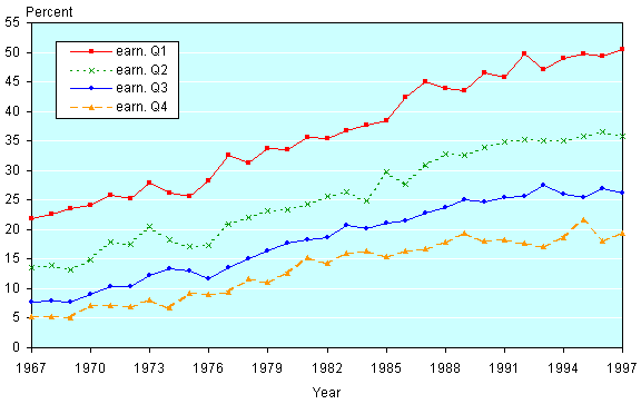
The change in the composition of married and nonmarried male populations may also have effects on benefits for men that are difficult to translate into poverty effects. Chart 6 shows the percentage of men in their thirties who are not married (that is, never married or divorced), by quartile of earnings from 1967 through 1997. Two things are apparent from the chart: low-earning men are much more likely to be unmarried than those with high earnings, and the percentage of nonmarried men has been rising at all earnings levels.
Nonmarried men aged 30–39, by earnings quartile.
| Year | earn. Q1 | earn. Q2 | earn. Q3 | earn. Q4 |
|---|---|---|---|---|
| 1967 | 21.76355 | 13.54406 | 7.68459 | 5.23408 |
| 1968 | 22.56508 | 13.91955 | 7.90982 | 5.1899 |
| 1969 | 23.47517 | 13.09668 | 7.7895 | 5.12474 |
| 1970 | 24.14769 | 14.83448 | 9.0592 | 7.15876 |
| 1971 | 25.74083 | 17.98544 | 10.38136 | 7.13482 |
| 1972 | 25.30419 | 17.42893 | 10.45226 | 6.96457 |
| 1973 | 27.92585 | 20.58068 | 12.30562 | 8.12516 |
| 1974 | 26.08833 | 18.18664 | 13.39589 | 6.84543 |
| 1975 | 25.69197 | 17.04892 | 13.08112 | 9.31654 |
| 1976 | 28.23611 | 17.29045 | 11.7087 | 8.97187 |
| 1977 | 32.66201 | 20.94166 | 13.59741 | 9.48199 |
| 1978 | 31.35206 | 21.95147 | 15.15146 | 11.63478 |
| 1979 | 33.71707 | 23.11611 | 16.45298 | 11.09922 |
| 1980 | 33.52983 | 23.43521 | 17.68177 | 12.68994 |
| 1981 | 35.65021 | 24.35789 | 18.34362 | 15.18485 |
| 1982 | 35.36798 | 25.59474 | 18.66033 | 14.28592 |
| 1983 | 36.6513 | 26.27895 | 20.70186 | 16.00019 |
| 1984 | 37.62819 | 24.87629 | 20.18884 | 16.4497 |
| 1985 | 38.38501 | 29.74916 | 21.11072 | 15.41695 |
| 1986 | 42.37976 | 27.707 | 21.37938 | 16.40308 |
| 1987 | 45.02723 | 30.84514 | 22.84133 | 16.7793 |
| 1988 | 43.80518 | 32.70735 | 23.67262 | 17.91415 |
| 1989 | 43.51515 | 32.51814 | 25.08662 | 19.32466 |
| 1990 | 46.46946 | 33.9928 | 24.72297 | 18.01298 |
| 1991 | 45.74852 | 34.82848 | 25.47255 | 18.2047 |
| 1992 | 49.77567 | 35.19619 | 25.63395 | 17.6887 |
| 1993 | 47.11206 | 34.97894 | 27.4774 | 17.0995 |
| 1994 | 48.97341 | 35.01505 | 25.91898 | 18.59317 |
| 1995 | 49.75311 | 35.70291 | 25.45818 | 21.71536 |
| 1996 | 49.3875 | 36.53991 | 26.89211 | 18.05721 |
| 1997 | 50.55265 | 35.78352 | 26.20786 | 19.45979 |
When nonmarried men have lower earnings than those who are married and when the percentage of nonmarried men is increasing, it is possible (even though it seems paradoxical) for the earnings of both married and nonnmarried men to rise relative to the average earnings of men. Therefore, the average benefits of married and nonmarried men could increase (along with spouse benefits), offsetting some of the poverty effects that might be predicted from a simple reweighting of the populations toward a greater proportion of nonmarried men.
The possible changes are actually more complicated. As shown in Chart 6, the shift among men from married to nonmarried status over the past three decades is larger among low-earning men than among those with high earnings, probably contributing to a wider gap between the average earnings of men who are married and nonmarried and adding another layer of opposing effects on poverty rates.
Changes in the Distribution of Earnings
Even if average wages grow faster than prices, earnings at the lower end of the distribution may not grow as fast as average earnings. In fact, there has been a tendency for wages of high earners to rise faster than wages of low earners in recent years. If that trend continues, the increase in average wages will give a misleading indication of the increase in wages for those workers who end up with benefits at or below the poverty line.
Many researchers using many different measures have found an increase in the dispersion of earnings in the past few decades (see, for example, Levy and Murnane (1992)). Chart 7 shows one such measure for the period 1967–1997: the ratio of earnings at various percentiles to median earnings, as tabulated from CPS data for March 1968 through March 1998. The position of male workers at the lowest three earnings percentiles shown (the 5th, 10th and 25th) has worsened over the past 30 years. On the other hand, workers at the highest percentiles are much better off relative to the median in 1997 than to that in 1967, with the largest gain going to the 95th percentile. If such a trend were to continue without pause for the succeeding decades, the use of the rise in average earnings to predict the increase in earnings at the lower end of the distribution and the benefits calculated from those earnings would overstate the increase in benefits for those at the lower end of the earnings distribution and would therefore overstate the decline in their poverty rates.
Earnings inequality for men aged 22–61.
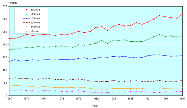
| Year | p95/med | p90/med | p75/med | p25/med | p10/med | p5/med |
|---|---|---|---|---|---|---|
| 1967 | 223.8806 | 179.1045 | 134.3284 | 68.10448 | 37.31343 | 21 |
| 1968 | 224.9086 | 182.7383 | 140.5679 | 70.28395 | 40.35704 | 21.08518 |
| 1969 | 229.8851 | 186.4623 | 135.3768 | 66.41124 | 38.31418 | 21.71137 |
| 1970 | 240.7685 | 188.3733 | 137.2255 | 67.36527 | 37.42515 | 19.81038 |
| 1971 | 235.2941 | 188.2353 | 140 | 65.29412 | 35.29412 | 18.82353 |
| 1972 | 238.0952 | 192.6407 | 138.5281 | 64.93506 | 32.56494 | 17.31602 |
| 1973 | 240 | 190 | 140 | 66.2 | 36.27 | 19.75 |
| 1974 | 238.0952 | 190.4762 | 142.8571 | 66.66667 | 33.33333 | 18.57143 |
| 1975 | 236.149 | 192.5522 | 143.4151 | 63.57856 | 31.78928 | 18.1653 |
| 1976 | 239.5833 | 194.7917 | 141.6667 | 63.33333 | 31.66667 | 16.275 |
| 1977 | 238.4615 | 192.3077 | 142.1154 | 61.53846 | 31.39231 | 16.34615 |
| 1978 | 245.0466 | 189.0359 | 140.0266 | 63.01197 | 32.20612 | 16.80319 |
| 1979 | 251.9894 | 198.939 | 145.8886 | 65.17242 | 33.1565 | 18.56764 |
| 1980 | 246.9136 | 197.5309 | 148.1481 | 61.72839 | 30.8642 | 16.04938 |
| 1981 | 251.4286 | 200 | 142.8571 | 57.71428 | 28.57143 | 14.02286 |
| 1982 | 266.6667 | 205.5556 | 146.7778 | 55.55556 | 25 | 11.47222 |
| 1983 | 270.2703 | 216.2162 | 151.3514 | 56.21622 | 25.2973 | 10.81081 |
| 1984 | 255 | 205 | 150 | 55.005 | 25 | 12.11 |
| 1985 | 272.156 | 217.7248 | 153.397 | 59.37948 | 27.53724 | 14.25108 |
| 1986 | 279.1182 | 216.4065 | 151.3861 | 56.7698 | 27.72259 | 13.53014 |
| 1987 | 272.7273 | 218.1818 | 154.5455 | 56.81818 | 27.27273 | 13.63636 |
| 1988 | 275.4237 | 211.8644 | 148.3051 | 57.20339 | 27.54237 | 14.83051 |
| 1989 | 285.7143 | 212.2449 | 151.0204 | 57.95918 | 28.57143 | 14.69388 |
| 1990 | 280 | 212 | 149.708 | 56 | 28 | 15.6 |
| 1991 | 288 | 220 | 156 | 56 | 25.872 | 13.9 |
| 1992 | 300 | 230.44 | 160 | 56 | 26 | 12.48 |
| 1993 | 313.3733 | 239.521 | 159.6806 | 59.88024 | 26.11577 | 12.37525 |
| 1994 | 308.9689 | 231.2139 | 156.6288 | 55.93884 | 27.96942 | 14.91702 |
| 1995 | 305.7554 | 233.813 | 154.6763 | 56.11511 | 28.77698 | 14.38849 |
| 1996 | 303.4483 | 229.6552 | 155.1724 | 55.94483 | 29.31035 | 15.86207 |
| 1997 | 320 | 233.3333 | 156.6667 | 60 | 30.77333 | 16.66667 |
There are several hurdles to quantifying the long-term effects of changes in the distribution of earnings on the distribution of future retirement incomes. First, it is difficult to extrapolate trends in the inequality of earnings. Although inequality in earnings has tended to increase by most measures in the past few decades, the longer historical view indicates that it can fall for long periods as well as rise. Extrapolating recent trends for 50 years into the future is therefore quite likely to be misleading.
The second hurdle is that of translating earnings trends into benefit trends. Even if the trends in the cross-sectional earnings distribution were known, the calculation of trends in worker benefit levels would require knowing how cross-sectional variation in earnings translates into variations in average lifetime earnings. The determination of trends in overall benefits—not just those of workers but also those of their spouses or widows—will also depend on the relationships between earnings inequality and marriage patterns. About all that can safely be said is that, because of the progressivity of the Social Security benefit formula, the decrease in worker benefits for low earners relative to average earners would be less than proportional to the decrease in average lifetime earnings for low earners relative to average earners.
Appendix A: Methods
Poverty Rate
The poverty rate of the elderly is the weighted number of persons aged 65 or older in families with simulated 1997-dollar incomes below the 1997 poverty threshold, divided by the weighted number of persons 65 or older.
The file used to make the estimates is actually a person-level extract from the Current Population Survey (CPS). Each person's record contains the family income components and the family poverty line for the person's family. For simulations in which benefits are scaled by a factor that depends on the person's age, the benefit adjustment calculated for a person is applied to the family benefits on that person's record. Married couples of different ages can therefore have slightly inconsistent adjustments applied to the family benefits on their separate records. Similarly, in simulations in which the weights are adjusted to reflect changing marital status composition in the population, the two records for a married couple of different ages may receive slightly different weight adjustments.
Projection of Incomes
For simulations of uniform growth in earnings, each family income component is adjusted by the ratio between past or projected real incomes in the simulation year and real incomes in 1997. For the future projections, the real incomes are assumed to rise at a constant percentage per year. Under the 1.0 percent per year growth scenario, for example, real incomes in 2027 are assumed to be 34.8 percent higher than in 1997 (1.0130 = 1.348). For years before 1997, the historical average annual earnings series is used, adjusted for inflation.
For simulations in which not all components of family income rise at the same rate, the components are adjusted separately and are then added up to a total family income, which is compared with the family poverty line.
For the component-by-component simulations of Charts 4 and 5, the appropriate component of family income is reduced by the appropriate percentage before adding up the total family income and comparing that with the family poverty line.
Calibration of 1997 Benefits to Reflect Legislative Changes and Earnings Growth
For the simulations in which benefits are adjusted to reflect legislated provisions for past and future benefits, benefit adjustment ratios are calculated for each age in each simulation year. Those ratios are determined by calculating the life history of nominal benefits for representative workers at each age in each simulation year, converting them to 1997 dollars, then dividing by the calculated benefits at each age in 1997. The result is a set of adjustment factors specific to age in 1997 that can be used to project the benefits of each CPS person to the corresponding real benefits in other simulation years.
A separate set of adjustment factors is calculated for each wage growth scenario, allowing the adjustments to take into account the effects on the age structure of benefits of changing the growth rate of wages relative to the growth rate of prices.
The nominal benefits are calculated as follows:
- The average annual wage indexing series is extended back to 1937 (from 1951) using other data on growth in wages.
- The extended average wage series is then used to calculate the benefits of steady earners born from 1869 (age 90 in 1959) through 1982 (age 62 in 2047). Workers are assumed to retire at age 62 or 65. (For workers reaching 62 before 1965, all are assumed to retire at 65. For workers reaching age 62 after that, benefits are calculated both ways—for retirement at 62 and for retirement at 65—and a cohort average is calculated using data on age at entitlement from the Annual Statistical Supplement to the Social Security Bulletin.)
- For each cohort of workers, benefits are calculated for ages 65 through 90. The benefits reflect the benefit provisions applicable to that cohort and the benefit increases (legislated or automatic) that applied to the benefits until the cohort reached 90.
The following provisions are taken into account:
- The "oldstart" benefit formula for workers with no or few earnings after 1950;
- The "newstart" benefit formula for workers with earnings in 1951 and after;
- The indexed earnings formula introduced in 1979, along with the transition to that formula;
- Legislated and automatic benefit increases in 1950 and after;
- The increasing tendency, once benefit entitlement before age 65 was allowed, to take benefits at age 62 (for the projections, the proportions at age 65 and 62 are held at their 1997 values);
- The currently scheduled changes in the normal retirement age to 66 and later to 67; and
- The changes in the number of benefit computation years that are included in the calculation but do not affect the benefits of the steady average workers used in the simulation.
The adjustments do not take into account the following:
- Changes in spouse and widow benefits that are not strictly proportional to the changes in worker benefits, and
- Changes in low-earner benefits that are not strictly proportional to changes in average worker benefits.
The benefit adjustment will be most accurate for workers with average benefits. For workers with benefits near the poverty line, the approximation will not be as accurate because of the shape of the benefit formula and because of the greater likelihood of being affected by changes in provisions for a number of years in the average earnings formula used to calculate the benefit formula. For auxiliary benefits—benefits paid to spouses and widows—the approximation will be accurate to the extent that such benefits have remained proportional to the worker benefits on which they were paid. There has been no attempt to model explicit changes in widow benefits.
Weight Adjustments to Reflect Changing Age
Projections from the Social Security Administration's Office of the Chief Actuary for population by age, sex, and marital status were used to determine weighting adjustments. (The projection used was the intermediate projection associated with the 2000 Trustees' Report.) For each person on the March 1998 CPS and for each projection year, the tabulation weight was scaled by the ratio of the population projection for that person's sex and marital status in the projection year to the population for that sex and marital status in 1997.
Appendix B: The March 1998 Current Population Survey
The 1998 March Current Population Survey (CPS) data file contains economic and demographic information pertaining to 1997. There are a total of 131,617 person-level observations. The main variables of interest are family income and its various components, such as income from Social Security benefits, earnings, pensions, and so forth.
Appendix Table B-1 provides summary statistics for most of those variables, reporting means, medians, and standard deviations. Men and women are almost equally represented in the data, with 48.2 percent and 51.8 percent, respectively. Whites make up approximately 85 percent of the sample; the elderly, defined here as all persons aged 65 or older, make up close to 12 percent.
| Mean | Median | Standard deviation | Number | |
|---|---|---|---|---|
| Total family income | 52,257.72 | 39,572 | 53,884.80 | 129,479 |
| Earnings (dollars) a | 50,800.09 | 40,000 | 52,001.84 | 111,943 |
| Pensions (dollars) b | 14,404.08 | 10,200 | 14,585.96 | 12,284 |
| Social Security benefits (dollars) | 11,387.49 | 10,292 | 7,060.13 | 25,898 |
| Supplemental Security Income (dollars) | 5,314.24 | 5,400 | 4,013.50 | 5,071 |
| Asset income (dollars) c | 4,948.89 | 560 | 15,727.55 | 76,257 |
| Age (years) | 34.86 | 34 | 22.22 | 131,617 |
| Elderly dummy (65+) | 0.1189 | 0 | 0.3237 | 131,617 |
| Race dummy (white) | 0.8509 | 1 | 0.3561 | 131,617 |
| Sex dummy (male) | 0.4825 | 0 | 0.4996 | 131,617 |
| NOTE: CPS March 1998 data file. For the first six variables, we consider only strictly positive values in calculating summary statistics. | ||||
| a. Earnings include wages and salaries, self-employment earnings, and farm earnings. | ||||
| b. Pensions include public and private pensions as well as survivor's income. | ||||
| c. Asset income includes dividends, interest, and rent. | ||||
Appendix Table B-2 presents the same summary statistics but focuses on the elderly. There are fewer men (42 percent) but more whites (89.4 percent) in this group.
| Mean | Median | Standard deviation | Number | |
|---|---|---|---|---|
| Total family income | 34,838.67 | 23,905 | 38,812.70 | 15,532 |
| Earnings (dollars) a | 30,652.44 | 18,000 | 43,229.42 | 5,081 |
| Pensions (dollars) b | 12,922.02 | 8,400 | 13,895.99 | 7,146 |
| Social Security benefits (dollars) | 12,757.94 | 11852 | 6,897.05 | 14,373 |
| Supplemental Security Income (dollars) | 4,039.43 | 3,468 | 3,357.75 | 897 |
| Asset income (dollars) c | 8,906.33 | 2,201 | 21,150.80 | 10,500 |
| Age (years) | 74.22 | 73 | 6.68 | 15,660 |
| Race dummy (white) | 0.8941 | 1 | 0.3076 | 15,660 |
| Sex dummy (male) | 0.4201 | 0 | 0.4936 | 15,660 |
| Note: CPS March 1998 data file. For the first six variables, we consider only strictly positive values in calculating summary statistics. | ||||
| a. Earnings include wages and salaries, self-employment earnings, and farm earnings. | ||||
| b. Pensions include public and private pensions as well as survivor's income. | ||||
| c. Asset income includes dividends, rents, and interest. | ||||
Appendix Table B-3 displays the coefficients of correlation Between the principal sources of income for all people and the elderly, respectively.
| SSI | Social Security | Pensions | Asset income | |
|---|---|---|---|---|
| All people (N=131,617) | ||||
| Social security benefits | 0.013 | 1 | 0.261 | 0.106 |
| Pensions a | -0.017 | 0.261 | 1 | 0.137 |
| Asset income b | -0.028 | 0.106 | 0.137 | 1 |
| Earnings c | -0.095 | -0.234 | -0.083 | 0.153 |
| Elderly (N=15,660) | ||||
| Social security benefits | -0.148 | 1 | 0.109 | 0.125 |
| Pensions a | -0.071 | 0.109 | 1 | 0.177 |
| Asset income b | -0.05 | 0.125 | 0.177 | 1 |
| Earnings c | -0.026 | -0.11 | -0.013 | 0.101 |
| NOTE: CPS March 1998 data file. | ||||
| a. Pensions include public and private pensions as well as survivor's income. | ||||
| b. Asset income includes dividends, interest, and rent. | ||||
| c. Earnings include wages and salaries, self-employment earnings, and farm earnings. | ||||
Notes
1. The National Academy of Sciences (NAS) has proposed a poverty line that would take into account benefits and expenses not included in the current poverty concept, redefine the thresholds for households of different sizes, and make regular adjustments to the minimum needs level. The full set of proposals was estimated to raise the 10.5 percent poverty line among the 1997 elderly to 17.4 percent. The same sort of long-term decline for the current definition, simulated in this paper, would also apply to the revised definition, although at a higher level, except that the continuing redefinition of the minimum needs level, by raising the real income levels of the poverty thresholds, can slow down or even halt the trend.
2. Income responses are not successfully elicited for every person in every household. For nonresponses, statistical techniques are used by the U.S. Census Bureau to fill in the missing items using information from similar families. Although these statistical imputations will be approximations on a case-by-case basis, they aim at getting answers that are correct when averaged over the whole population.
3. Asset income includes dividends, interest, and rent. Some components of income for the elderly are not included in Table 1: unemployment compensation, veterans' payments, disability payments, and miscellaneous other components. Each of the omitted components is less than 1 percent of income for the elderly. As a group, the omitted components add up to about 2.6 percent of that income and 6.4 percent of income for the nonelderly.
4. Although many reform proposals would reduce Social Security benefits, some proposals seek to protect lower-income beneficiaries by focusing more of the reductions on higher-income beneficiaries. It is difficult, therefore, to make general estimates of the effects of solvency reforms on poverty rates. An across-the-board reduction of 30 percent to all benefits after 2037 (approximately enough for 75 years of solvency without changing taxes) would raise the poverty level in 2047 from the 4 percent level indicated in Chart 3 to about 11 percent. Effects on poverty rates would be smaller if proposals were successful in protecting beneficiaries in poverty from the benefit reductions.
5. Although SSI payments have always been tied to prices, some economists have proposed basing them on Social Security benefits. This would effectively link SSI benefits to wages. See, for example, McGarry (2000).
References
Board of Trustees of the Federal Old-Age and Survivors Insurance and Disability Insurance Trust Funds. 2000. 2000 Annual Report. Washington, D.C.: U.S. Government Printing Office.
Johnson, David S., and Timothy M. Smeeding. 2000. "Who are the Poor Elderly? An Examination Using Alternative Poverty Measures." Unpublished material obtained from the U.S. Census Bureau website: www.census.gov/hhes/poverty/povmeas/papers.html. February.
Levy, Frank, and Richard J. Murnane. 1992. "U.S. Earnings Levels and Earnings Inequality: A Review of Recent Trends and Proposed Explanations." Journal of Economic Literature 30(3): 1333–1381.
McGarry, Kathleen. 2000. Guaranteed Income: SSI and the Well Being of the Elderly Poor. NBER Working Paper No. 7574. Cambridge, Mass.: National Bureau of Economic Research.
Short, Kathleen, and John Iceland. 2000. "Who is Better Off Than We Thought? Evaluating Poverty with a Different Measure." Unpublished material obtained from the U.S. Census Bureau website: www.census.gov/poverty/povmeas/papers.html. January.